
Google’s Fullscreen Account Switcher: A Design Overreach?
Google is currently rolling out a redesign of its Account switcher across its first-party Android applications, a change that replaces the familiar card-like interface with a fullscreen experience. While the redesign appears to be aligned with Material 3’s "Expressive" design principles, the shift raises questions about its necessity and potential drawbacks. This new approach, while visually distinct, may actually detract from the user experience by obscuring context, disrupting navigation, and introducing unnecessary visual complexity.
The old Account switcher, a rounded rectangle that appeared above the current screen, offered a subtle but effective way to manage accounts without completely interrupting the user’s workflow. It darkened the background, allowing users to still see the content they were previously interacting with, such as emails or map views, along with the bottom navigation bar. This provided a sense of continuity and maintained spatial awareness within the app.
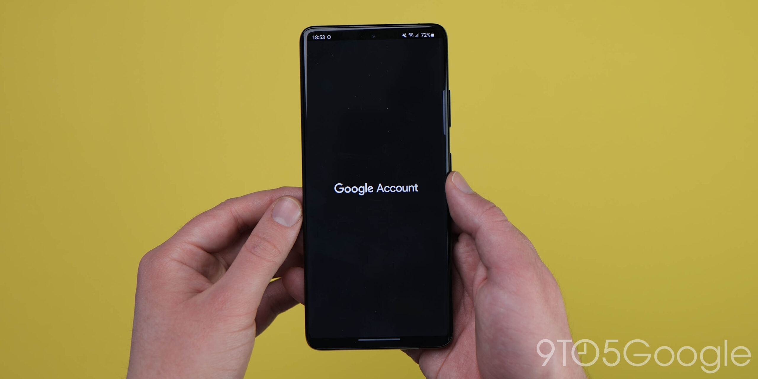
The new fullscreen design, however, abandons this approach entirely. Upon tapping the profile image, the entire screen is taken over by a greeting, a large profile image, and the account management options. While the intention may be to create a more prominent and focused experience, the result feels wasteful and disruptive, particularly in apps where the primary function is to list accounts.
One of the most significant drawbacks of the fullscreen Account switcher is its impact on navigation and spatial context. In apps like Google Maps, the account menu serves as a central hub for accessing key features such as Your Timeline, Location sharing, Offline maps, and Settings. By divorcing these elements from the main app interface and placing them within a fullscreen overlay, Google risks isolating them and making them less accessible. The addition of a "More from Maps" header further highlights this disconnect, suggesting that the design team recognized the potential for confusion.
This disruption to in-app navigation could potentially lead to Google moving content out of the profile menu altogether, relocating it to less isolated areas within the app. While this might address the immediate navigation issue, it would also necessitate a broader redesign of the app’s structure, potentially creating further inconsistencies across Google’s suite of applications.
The fullscreen Account switcher appears to be an attempt to create a system-level element that operates independently of the underlying application. While Google Accounts are undeniably important, the profile switching page should primarily serve the application in which it resides, rather than the other way around. The new design, however, seems to prioritize the account management experience at the expense of the overall app experience.
Furthermore, the fullscreen design introduces a scrolling requirement in some instances, particularly when the list of accounts is extensive. This can lead to awkward visual cutoffs at the top of the screen, further detracting from the user experience.
While Material 3’s "Expressive" design principles emphasize organizing content into logical groupings, the fullscreen Account switcher may be an example of this principle being applied inappropriately. The existing account list was already clear and concise, and the extra padding and visual separation introduced by the new design feel unnecessary. The placement of "Turn on Incognito mode" at the top of the list, while intended to be prominent, feels artificially emphasized due to the excessive spacing.
Another point of contention is the transition animation used for the fullscreen UI. The abrupt sliding motion with sharp edges feels outdated and inconsistent with the softer, more organic aesthetics of modern Material Design. This abrupt transition is reminiscent of the early days of Material Design, when graphical resources were more limited.
Interestingly, the fullscreen Account switcher adopts a different approach on tablets, where it appears as a floating window similar to the old phone experience. This inconsistency highlights the arbitrary nature of the fullscreen design on phones, as the tablet implementation demonstrates that a more restrained approach can still be effective and visually appealing.
A more sensible approach would have been to update the existing card-like Account switcher with new visual elements and Material 3 design principles. This would have provided a modern look and feel without disrupting the user’s workflow or compromising in-app navigation. Instead, the fullscreen design feels like an attempt to introduce a new UI concept that adds visual complexity without offering any tangible benefits. It prioritizes aesthetics over usability and ultimately detracts from the overall user experience. The redesign, while aligned with Material 3 principles, overemphasizes the profile switching function, disrupting the flow of other apps.