
Google’s Material 3 Expressive: A Bold New Direction for Design
Google is poised to unveil a significant shift in its design philosophy with Material 3 Expressive, a radical departure from the clean, minimalist aesthetics that have characterized recent iterations of Material Design. A prematurely published blog post, later salvaged by the Wayback Machine, provides a glimpse into Google’s thinking and the extensive research underpinning this ambitious project. Material 3 Expressive, also referred to as "M3 Expressive" or simply "expressive design," represents what Google claims is the most thoroughly researched update to its design system to date, signaling a commitment to crafting interfaces that resonate with users on a deeper, more emotional level.
The impetus behind this transformation stems from a growing concern within Google’s Material Design team. In 2022, they began questioning the increasing uniformity and perceived blandness of many applications, pondering whether there was an opportunity to inject more feeling and personality into digital experiences. This introspection led to a comprehensive research initiative aimed at understanding how design could be leveraged to create more engaging and emotionally resonant interfaces.
The leaked blog post highlights the core principles of Material 3 Expressive, emphasizing the strategic deployment of fundamental design elements like color, shape, size, motion, and containment. Google envisions a future where apps move beyond the perceived limitations of "clean" and "boring" designs, embracing bolder choices to forge stronger connections with users. Material 3 Expressive is explicitly characterized by its "bold use of shape and color," with the ultimate goal of creating genuinely "delightful user experiences."
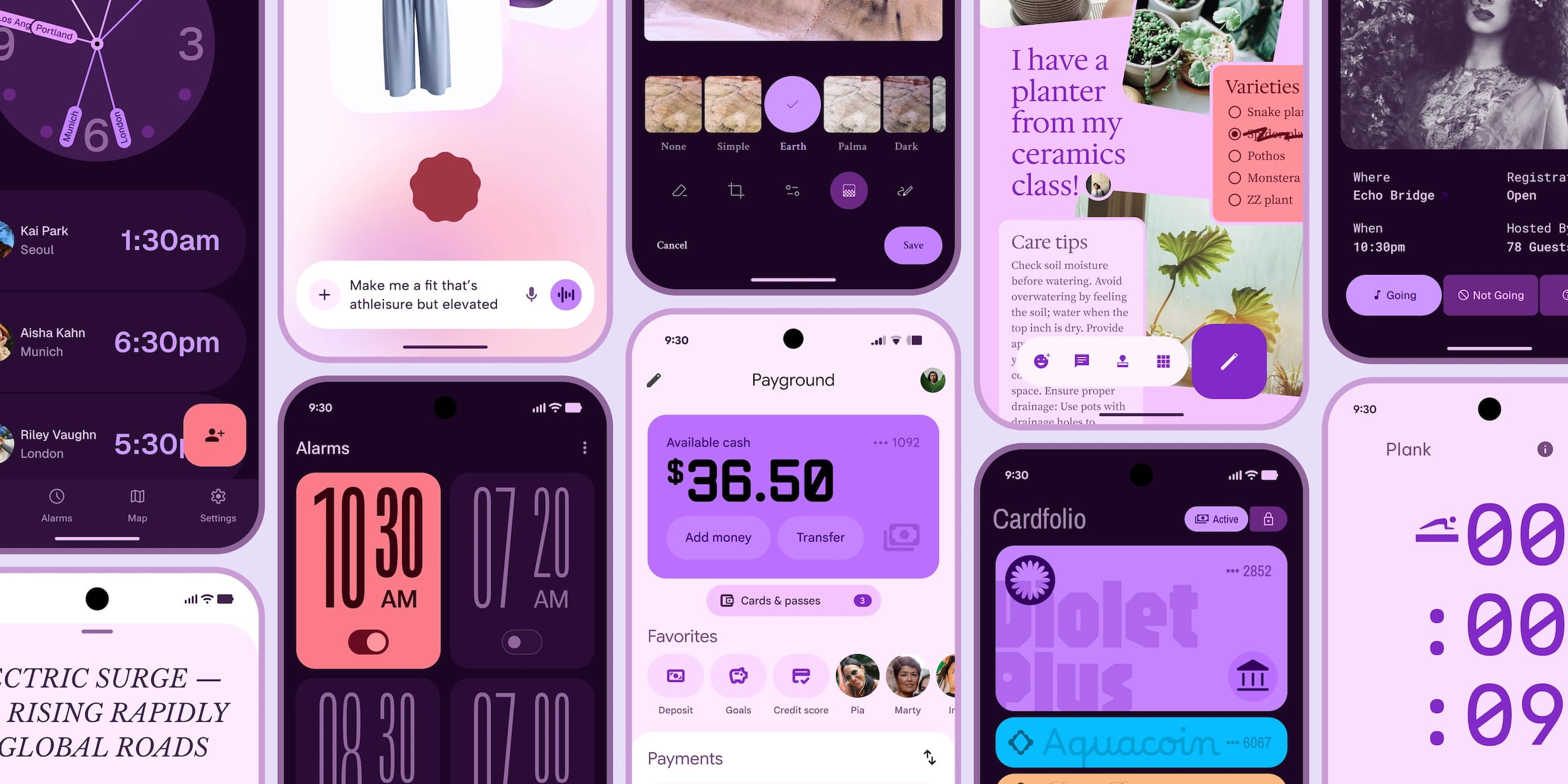
One tangible example of this new direction is the introduction of a "floating toolbar." Concept designs showcase a pill-shaped bottom bar that doesn’t extend across the entire width of the screen. This design choice allows a sliver of the background to remain visible, underscoring the growing importance of edge-to-edge designs in modern user interfaces. The floating toolbar bears a striking resemblance to the bottom bar currently implemented in Google Chat, hinting at a potential wider adoption of this design element across Google’s suite of applications.
Beyond aesthetics, Google’s research suggests that expressive designs offer tangible usability benefits. According to their findings, "expressive designs are easier to use," enabling users to "quickly spot the key action on each screen and navigate more quickly." This assertion implies that the strategic use of visual cues and a more dynamic interface can enhance user comprehension and streamline the overall user experience.
It is crucial to emphasize that the leaked materials represent concept designs, not final products. They offer a window into Google’s evolving design thinking but should not be interpreted as a definitive preview of upcoming product updates. The recent leak of a Google Clock redesign, however, might offer a more concrete glimpse into the direction Google is heading. Nevertheless, the leaked concepts offer valuable insights. A "before" and "after" comparison vividly illustrates the potential transformation, with the "before" example clearly depicting Gmail’s current user interface. Other concept designs preview expressive interpretations of apps like a clock app, voice input interface, photo editor, payments platform, and a digital wallet.
Perhaps one of the most compelling revelations from Google’s research is the positive user response to expressive designs. User testing revealed that "a well-applied expressive design is strongly preferred by people of all ages over non-expressive design that followed the iOS Human Interface Guidelines." This finding challenges the notion that minimalist designs are universally preferred and suggests that a more expressive approach can resonate with a broader audience.
Furthermore, Google discovered that "expressive designs are cool," specifically in terms of brand perception. "Our research showed that using M3 Expressive design boosted how ‘cool’ people thought a product was." This finding underscores the potential for Material 3 Expressive to not only improve usability but also to enhance brand image and differentiate Google’s products in a competitive market.
The implications of Material 3 Expressive extend beyond mere visual changes. It represents a fundamental shift in Google’s approach to design, prioritizing emotional connection and user engagement alongside traditional usability considerations. By embracing bolder colors, more dynamic shapes, and more pronounced motion, Google aims to create digital experiences that are not only functional but also enjoyable and memorable.
The success of Material 3 Expressive will ultimately depend on its implementation. While the concept designs show promise, the execution will be crucial in ensuring that the expressive elements enhance, rather than detract from, the user experience. Google must strike a delicate balance between boldness and clarity, ensuring that the design remains intuitive and accessible for all users.
The upcoming announcement promises to shed more light on Google’s vision for Material 3 Expressive. It will be fascinating to see how these concepts translate into real-world products and how users ultimately respond to this bold new direction for design. Material 3 Expressive has the potential to reshape the landscape of user interface design, ushering in an era of more expressive, engaging, and emotionally resonant digital experiences. The leaked blog post provides a tantalizing preview of what’s to come, signaling a significant evolution in Google’s design philosophy and a commitment to creating interfaces that truly connect with people on a human level. This is not simply a visual refresh, but a fundamental rethinking of the role of design in creating meaningful and memorable user experiences.