
Google Rolls Out Subtle But Significant Update to its Iconic ‘G’ Logo
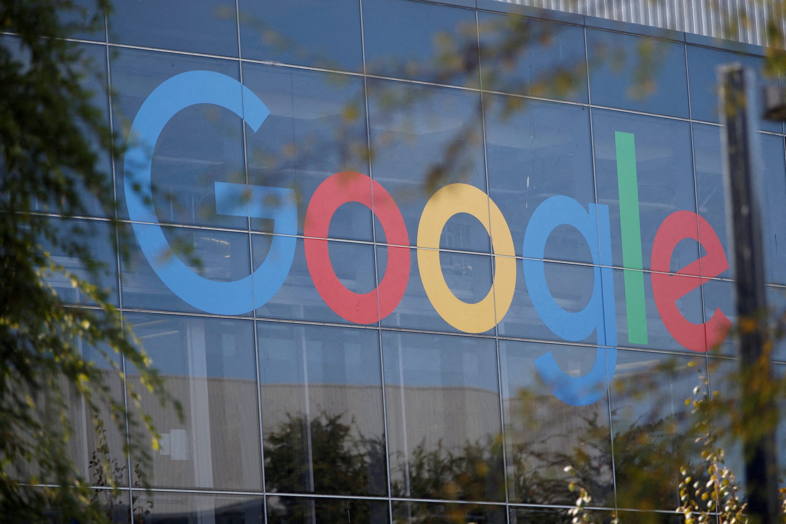
Google has quietly introduced a refreshed version of its prominent ‘G’ icon, marking the first significant alteration to the design in almost a decade. The change, initially observed on May 12th, involves a shift from the solid, four-color block design to a gradient effect applied across the letter. This subtle yet noticeable tweak signals Google’s continued commitment to refining its brand identity in the ever-evolving digital landscape.
The updated icon has already made its debut within the Google Search app on iOS devices. Android users have also spotted the new ‘G’ gracing the app icon following the 16.18 (beta) update. However, the gradient-infused ‘G’ is not yet universally deployed across all of Google’s branding assets. As of Monday, the refresh has not appeared in other areas of the company’s visual identity. This raises questions about whether this is a limited test or the start of a broader brand refresh.
The lack of an immediate, widespread rollout suggests that Google is carefully evaluating the reception to the new design before implementing it across all platforms and marketing materials. Such a measured approach aligns with the company’s history of strategic brand evolution. They’re likely monitoring user feedback and analyzing data to ensure the change resonates with its vast global audience.
Interestingly, this visual update arrives just days before Google’s highly anticipated I/O 2025 developer conference, scheduled to begin on May 20th. The timing may be coincidental, but it is possible that Google intends to showcase the updated logo more prominently during the event, potentially alongside other branding announcements. Google I/O serves as a prime platform for the company to unveil its latest innovations, and a refreshed brand identity would certainly complement the forward-thinking narrative the event typically conveys.
The previous iteration of the Google ‘G,’ characterized by its distinct color-block design, was initially introduced in September of 2015. This marked a significant shift in Google’s visual branding strategy. In addition to the ‘G’ icon, the company simultaneously unveiled a new wordmark utilizing a typeface known as Product Sans. This move signaled a departure from the previous lowercase white ‘g’ on a blue background, opting for a bolder, more modern aesthetic.
In a 2015 blog post announcing the sweeping changes, Google emphasized the need to adapt its logo and branding for a rapidly changing technological landscape. The company acknowledged that its original branding was primarily designed for a single desktop browser page. As technology evolved to encompass a vast array of devices and input methods, Google recognized the importance of creating a more versatile and adaptable visual identity. The goal was to seamlessly integrate the Google brand across an "endless number of devices and different kinds of inputs," reflecting the ubiquity of Google’s services in modern life.
The transition to the color-block ‘G’ in 2015 was not merely a cosmetic upgrade, but a strategic maneuver to position Google as a forward-thinking and adaptable company. The choice of Product Sans for the wordmark further reinforced this message, presenting a clean and modern typeface that resonated with a global audience.
The design of the original Google logo dates back to the company’s early days. Ruth Kedar, the designer responsible for the original Google logo, provided insights into the design process in a 2023 interview with the company. Kedar explained that the initial logo aimed to "evoke the traditions of the past while also being forward looking." This balance between tradition and innovation has remained a consistent theme throughout Google’s brand evolution.
The subtle gradient applied to the new ‘G’ icon suggests a continuation of this philosophy. While retaining the core elements of the existing design, the gradient effect adds a layer of depth and sophistication, reflecting the ongoing evolution of Google’s products and services. It is a subtle nod to the future while remaining grounded in the company’s established brand identity.
The introduction of the gradient ‘G’ sparks speculation about the potential for further branding updates from Google. While the company has remained tight-lipped about its plans, the initial change raises questions about whether other elements of Google’s visual identity will be refreshed in the near future. It’s conceivable that Google may be planning a broader overhaul of its branding strategy, gradually rolling out changes over time to minimize disruption and maximize impact.
The tech industry is constantly evolving, and companies must adapt their brands to remain relevant and engaging. Google’s subtle logo update serves as a reminder of the importance of visual identity in the digital age. A well-designed logo can help a company stand out from the competition, communicate its values, and build brand loyalty. As Google continues to innovate and expand its reach, its evolving logo will undoubtedly play a crucial role in shaping its public image.
USA TODAY reached out to Google for comment on the logo update but did not receive an immediate response. The lack of official communication surrounding the change only adds to the intrigue, leaving users and industry observers to speculate about the company’s long-term branding strategy. As Google I/O 2025 approaches, the tech world eagerly awaits any further announcements or insights into the future of the Google brand.
The decision to subtly tweak the ‘G’ logo rather than implement a radical redesign speaks volumes about Google’s confidence in its existing brand identity. The company understands that its logo is instantly recognizable to billions of people around the world. A drastic change could alienate users and undermine the brand’s established equity. By opting for a more gradual and nuanced approach, Google is able to update its visual identity without sacrificing the familiarity and trust it has cultivated over the years. The gradient provides a fresh look while maintaining brand recognition, which is no small feat for a company as ubiquitous as Google.
Ultimately, the long-term impact of Google’s updated ‘G’ logo remains to be seen. However, the initial change serves as a clear indication that the company is committed to refining its brand identity and adapting to the ever-evolving digital landscape. Whether this is a standalone update or the first step in a broader branding overhaul, the subtle shift underscores Google’s ongoing efforts to maintain its position as a leader in innovation and design.