
Google Clock App Undergoes Significant Redesign Ahead of Material 3 Expressive Launch
The Google Clock app, a ubiquitous and essential tool on Android devices, is poised to receive a major overhaul, aligning it with the upcoming Material 3 Expressive design language. Leaks surfacing just ahead of Google I/O 2025, scheduled later this month, reveal a comprehensive redesign that promises a cleaner, more intuitive, and visually refreshed user experience. The leaked screenshots, courtesy of Mystic Leaks, a source previously known for accurately revealing details about Android 16, paint a picture of an app that has been meticulously refined from the bottom up.
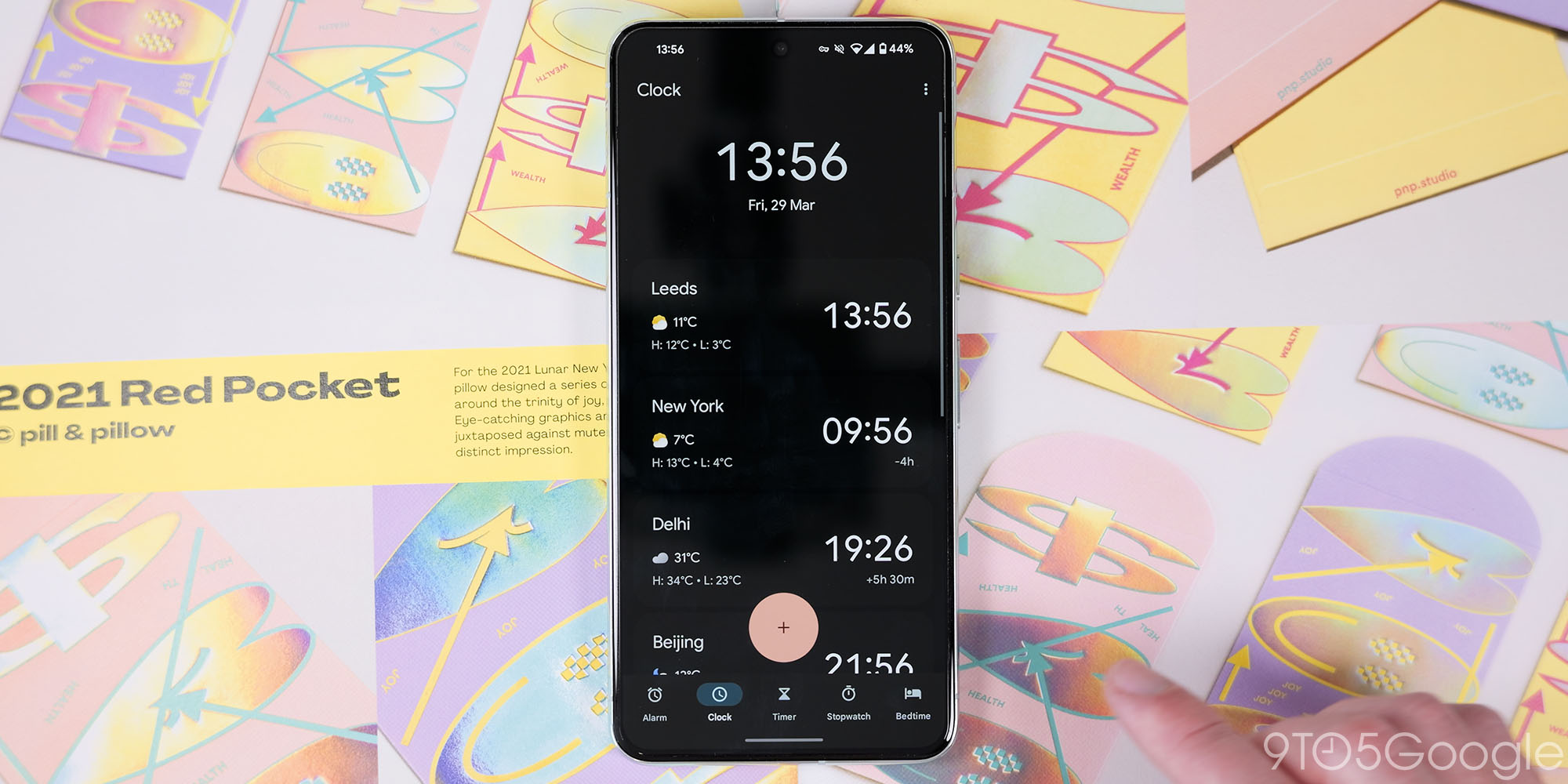
The redesign touches upon almost every facet of the Clock app, from the foundational navigation structure to the individual elements within each tab. The most immediate change users will notice is the revamped bottom navigation bar. This element, responsible for facilitating access to the core functions of the app, has been subtly but effectively tweaked. The previously distinct tab icons have been given a more detailed and nuanced appearance, injecting a greater level of visual polish. Furthermore, the tab labels have been thoughtfully renamed to enhance clarity and user understanding. "Clock" has been rebranded as "World Clock," emphasizing its primary function, while "Alarms" and "Timers" now adopt more descriptive pluralized forms. These seemingly minor changes contribute to a more user-friendly and accessible experience.
The Alarms tab, arguably the most frequently used section of the app, receives a significant visual update. Retaining the familiar large Floating Action Button (FAB), Google has opted for a rounded square design, repositioning it to the bottom-right corner for improved ergonomics and reachability. This subtle shift in placement aims to make the FAB more accessible, especially for users with larger screens.
The alarm creation and editing process has also been streamlined. Tapping on the FAB triggers the appearance of a bottom sheet, featuring a redesigned time selector at the top. Below the selector, users will find a comprehensive suite of customization options, including the ability to assign an alarm name, select a custom sound, enable vibration, and even integrate weather forecasts and Google Assistant routines. This level of integration highlights Google’s commitment to providing a cohesive and feature-rich ecosystem. Notably, a new font is implemented throughout the entire application, contributing to a more modern and consistent aesthetic.
One of the most impactful visual changes is the introduction of background highlighting for active alarms. This instantly draws the user’s attention to currently active alarms, improving visibility and preventing missed wake-up calls. Complementing this is a more prominent "Dismiss" button, making it easier and more intuitive to deactivate alarms. The redesigned Material 3 on/off toggles, narrower and more refined than their predecessors, further contribute to the app’s overall visual coherence.
The Timers tab also benefits from the design refresh. The timer creation interface now includes a selection of preset increments at the bottom, enabling users to quickly set common timer durations. A highly requested feature, the ability to name timers, has also been implemented, allowing for better organization and identification of multiple concurrent timers. The traditional "play" icon has been replaced with a more descriptive "Start" button, reducing ambiguity and making the interface more accessible to novice users. Active timers receive a visual update as well, with the play/pause controls being moved inside the timer circle for a cleaner and more integrated look.
The Stopwatch feature has undergone a radical simplification. The previous circle motif has been discarded in favor of a straightforward display of digits. The control icons have been replaced with larger text buttons for "Stop," "Reset," and "Lap," prioritizing clarity and ease of use over visual flair. This change emphasizes the stopwatch’s core functionality, making it more accessible to users of all skill levels.
While the Bedtime tab remains largely unchanged, the redesigned World Clock tab remains shrouded in mystery, as no screenshots of this section were included in the leak. However, the absence of visual information does not negate the significance of the other changes.
Perhaps one of the most significant technical updates is the complete migration of the Clock app to Jetpack Compose, Google’s recommended modern toolkit for building native UIs. This transition allows for a more streamlined development process, improved performance, and greater flexibility in implementing future features. By adopting Jetpack Compose, Google demonstrates its commitment to utilizing the latest technologies and ensuring the long-term maintainability of the Clock app.
It is crucial to remember that the leaked design is still subject to change before its official launch. Google may choose to further refine or alter certain aspects of the app based on internal testing and user feedback. Nevertheless, the leaked screenshots provide a valuable glimpse into Google’s vision for the future of the Clock app.
Overall, the Material 3 Expressive redesign represents a significant step forward for the Google Clock app. Google has seized the opportunity to not only modernize the app’s appearance but also enhance its usability and intuitiveness. By prioritizing clarity, simplicity, and visual coherence, the redesign promises to make the Clock app an even more indispensable tool for millions of Android users worldwide. The focus on user experience and the adoption of modern development practices suggest a long-term commitment to improving and evolving this essential application. The redesigned Google Clock app is poised to debut alongside Material 3 Expressive, and its arrival will undoubtedly be welcomed by Android users seeking a cleaner, more functional, and visually appealing timekeeping experience.