
Google’s "Funky" Android UI: A Bold Departure or a Visual Overload?
Google’s penchant for experimentation, sometimes bordering on the eccentric, has once again surfaced with the self-leaked details of its upcoming Android visual refresh. Dubbed "Material 3 Expressive," this design language promises a bold, "in-your-face" aesthetic, a stark contrast to the more subdued and, some might argue, increasingly homogenized smartphone interfaces we’ve come to expect. But is this "funky" new direction a genuine leap forward in usability and user experience, or merely a visually jarring exercise in differentiation?
The initial reveal came through a blog post, prematurely published and subsequently removed, ahead of Google’s annual I/O developer conference. While the post itself was scrubbed from the internet, the eagle-eyed folks at 9to5Google managed to capture screenshots and details, preserving a glimpse into Google’s ambitious redesign. The Wayback Machine also holds a record of the text and header video, further solidifying the leak’s authenticity.
Google describes Material 3 Expressive as its "most-researched update to Google’s design system, ever," claiming it will improve the speed at which users can identify key UI elements by up to four times. This efficiency boost is attributed to the use of larger bubbles, bolder text, and a more visually distinct approach to UI design. The underlying philosophy seems to be centered around creating a more emotionally engaging experience, moving away from what Google considers the "boring" lists characteristic of standard Android apps. The company even went as far as to suggest that Material 3 Expressive enhances the "coolness" factor of an application, a metric that raises eyebrows and questions the priorities driving the redesign.
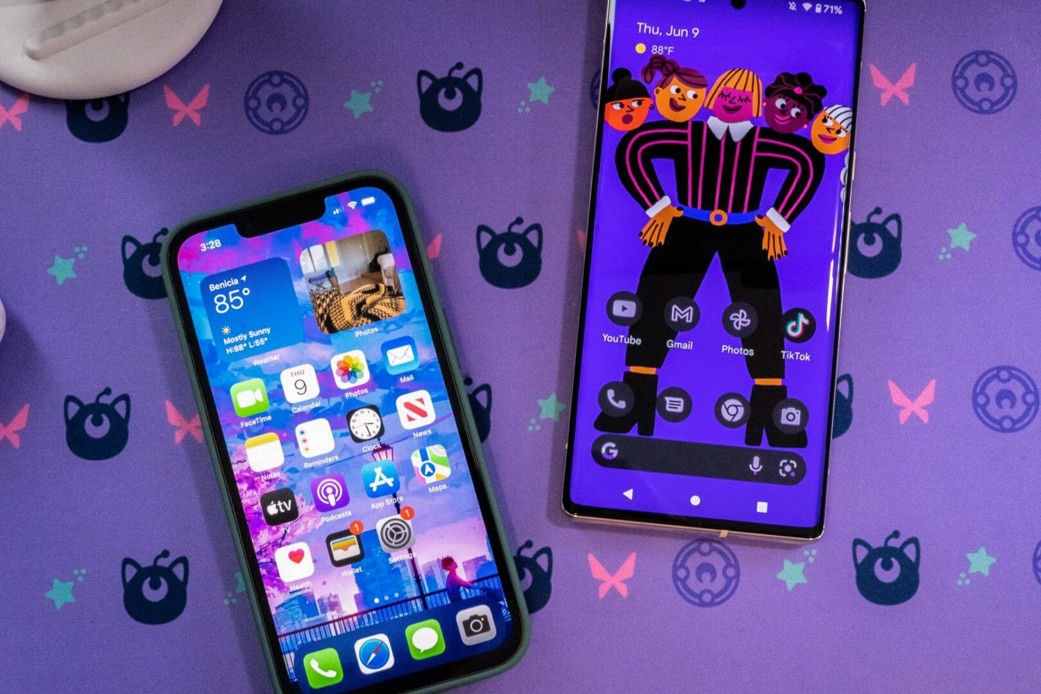
One of the defining features of this new design language is a pill-shaped "floating toolbar" appearing at the bottom of various apps. Google’s internal research apparently indicates that emphasizing size and contrast improves usability, particularly for younger users. The blog post even included a subtle jab at Apple, stating that "well-applied expressive design is strongly preferred by people of all ages over non-expressive design that followed the iOS Human Interface Guidelines." This competitive spirit highlights the pressure on both tech giants to innovate and differentiate their mobile operating systems.
Interestingly, while Google is embracing a more expressive and visually assertive design, Apple seems to be heading in the opposite direction with its upcoming iOS 19. Reports from reliable sources suggest that Apple is aiming to unify its interface across its iPhone, iPad, and Mac product lines. This rumored unification could involve incorporating circular, bubble-shaped app icons, mirroring the visual style of the Vision Pro’s "spatial" interface. It remains to be seen whether Apple will finally deliver on its promises of significant AI integration with the long-awaited Apple Intelligence features, especially after a period of internal restructuring prompted by underwhelming AI performance.
The initial reaction to the leaked Android UI has been mixed. While the promise of a more distinctive and visually engaging experience is appealing, concerns remain about the potential for visual clutter and reduced usability. Some critics argue that the emphasis on aesthetics could come at the expense of clarity and efficiency.
For instance, the leaked screenshot of the "Your Mix" screen was criticized for resembling a poster advertisement rather than a clean and intuitive UI for selecting content. While certain apps, such as the clock, payments, and wallet apps, appear to benefit from the redesign due to their focus on presenting essential information upfront, other implementations raise concerns. The redesigned Gmail interface, with its oversized "send" button consuming nearly half the phone’s screen, exemplifies the potential for visual overload and compromised usability.
Furthermore, there are indications that Google may still be drawing inspiration from Apple in other areas. Reports suggest that Android 16 will include resizable and modular Quick Setting tiles, mirroring the modular Control Center recently introduced in iOS 18. This highlights the ongoing cycle of innovation and imitation between the two operating systems. As smartphones have matured and become ubiquitous, it’s natural to expect a degree of convergence in features and functionality.
Ultimately, the success of Material 3 Expressive will depend on whether it can strike a balance between visual appeal and usability. While the bold design choices may appeal to some users, others may find the increased visual complexity overwhelming and distracting. The key question is whether this redesign will genuinely improve the Android user experience or simply offer a fleeting moment of "coolness" at the expense of functionality. It is a gamble that Google is willing to take, placing a bet on the power of expressive design to emotionally connect with its users and differentiate itself from the competition. Only time will tell if this gamble pays off. The industry and users alike will be watching closely to see if Google’s vision of a "funky" future for Android will resonate or ultimately fall flat.