
Google Revamps Gemini Web App with a Fresh Side Panel Design
Google is in the process of deploying a significantly updated side panel design for its Gemini web application, aiming to enhance user experience through several quality-of-life improvements. This redesign focuses on streamlining navigation, providing easier access to frequently used features, and decluttering the interface. The changes, currently being rolled out to a wider audience, touch upon visual elements, organizational structure, and overall functionality, making the Gemini web app more intuitive and user-friendly.
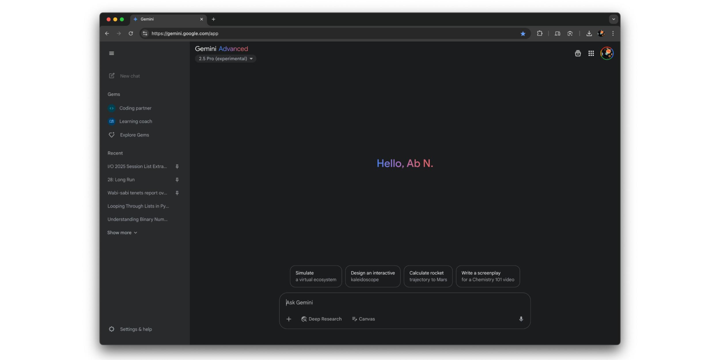
One of the most immediately noticeable changes is the redesigned "New chat" button. Google has opted for a flatter, more modern aesthetic by removing the pill-shaped background that previously surrounded the button. This subtle shift contributes to a cleaner and less cluttered look. Furthermore, the simple ‘plus’ icon previously used to signify the start of a new conversation has been replaced with a more descriptive and visually informative icon. This new icon more clearly represents the action of initiating a new chat, making it easier for users, especially newcomers, to understand its purpose at a glance. This seemingly minor change can have a significant impact on usability, reducing ambiguity and improving the overall clarity of the interface.
The reordering of elements within the side panel is another key improvement. "Gems," the feature allowing users to create custom versions of Gemini tailored for specific tasks, now occupies a more prominent position, appearing directly below the "New chat" button. The interface displays the user’s two most recently accessed Gems, providing quick and easy access to these customized AI tools. Additionally, a direct link to the "Explore" page is conveniently placed alongside the displayed Gems, encouraging users to discover and experiment with different Gem configurations. This repositioning highlights the importance of Gems within the Gemini ecosystem and promotes their usage by making them readily accessible. By showcasing recent Gems and providing a clear pathway to discover new ones, Google aims to encourage users to leverage the power of customization offered by the platform.
Perhaps the most significant enhancement lies in the improved handling of chat history within the "Recent" section. Previously, users were limited to viewing only a handful of recent chats initially, requiring them to repeatedly click a "Show more" button to load additional conversations. This process was often cumbersome and time-consuming, especially for users with extensive chat histories. The redesigned side panel eliminates this limitation by introducing a continuous scrolling mechanism. Now, after tapping "Show more," users can simply scroll down to view their entire chat history, providing a seamless and intuitive browsing experience. This improvement significantly enhances the usability of the Gemini web app, making it much easier for users to find and revisit previous conversations. The elimination of the repetitive clicking requirement streamlines the process of accessing older chats, saving users time and effort.
Another notable aspect of the redesign is the consolidation of various settings and options into a unified "Settings & more" menu. Previously, these options were presented as a separate column of four icons, which could appear visually cluttered, especially when the side panel was minimized. The new "Settings & more" menu streamlines this aspect of the interface by grouping all these options under a single, easily recognizable heading. This menu encompasses a wide range of settings and features, including:
- Activity: Access to the user’s Gemini activity history.
- Saved info: Management of saved information used by Gemini.
- Apps: Integration settings for connected applications.
- Your public links: Management of publicly shared Gemini conversations.
- Dark theme: Toggle for switching between light and dark themes.
- Manage subscription: Access to subscription management options.
- Send feedback: A direct channel for users to provide feedback to Google.
- Help: Access to help documentation and support resources.
- Current location: Settings related to location awareness.
By consolidating these diverse options into a single menu, Google has significantly decluttered the interface and made it easier for users to find the specific settings they are looking for. The "Settings & more" menu provides a centralized hub for managing various aspects of the Gemini web app, contributing to a more organized and intuitive user experience.
The comprehensive nature of this redesign extends beyond the desktop version of the Gemini web app. Google has also ensured that the updated side panel design is implemented on the mobile web version, providing a consistent user experience across different devices. This consistency is crucial for users who access Gemini from both desktop and mobile devices, as it allows them to navigate the interface with familiarity and ease, regardless of the platform they are using. The adaptation of the redesigned side panel to the mobile web version demonstrates Google’s commitment to providing a seamless and unified experience for all Gemini users.
The Gemini side panel redesign is more than just a cosmetic update; it is a comprehensive effort to improve the usability and efficiency of the Gemini web application. By streamlining navigation, providing easier access to frequently used features, decluttering the interface, and ensuring a consistent experience across devices, Google is making Gemini a more user-friendly and powerful tool for users of all levels of experience. The redesign reflects a clear understanding of user needs and a commitment to continuous improvement, making the Gemini web app a more intuitive and enjoyable platform to use. As the rollout continues, users can expect to experience a more refined and streamlined experience when interacting with Gemini.