
Gboard Android Beta Tests Bold New Circle and Pill-Shaped Key Design
Google is shaking up the aesthetic of its popular keyboard app, Gboard, for Android, introducing a striking new design element for select beta testers. The update, currently being trialed with a limited group of users on the Gboard beta program (version 15.1), replaces the familiar rounded rectangle key borders with a more modern and rounded look, utilizing circles and pill-shaped designs for the keys.
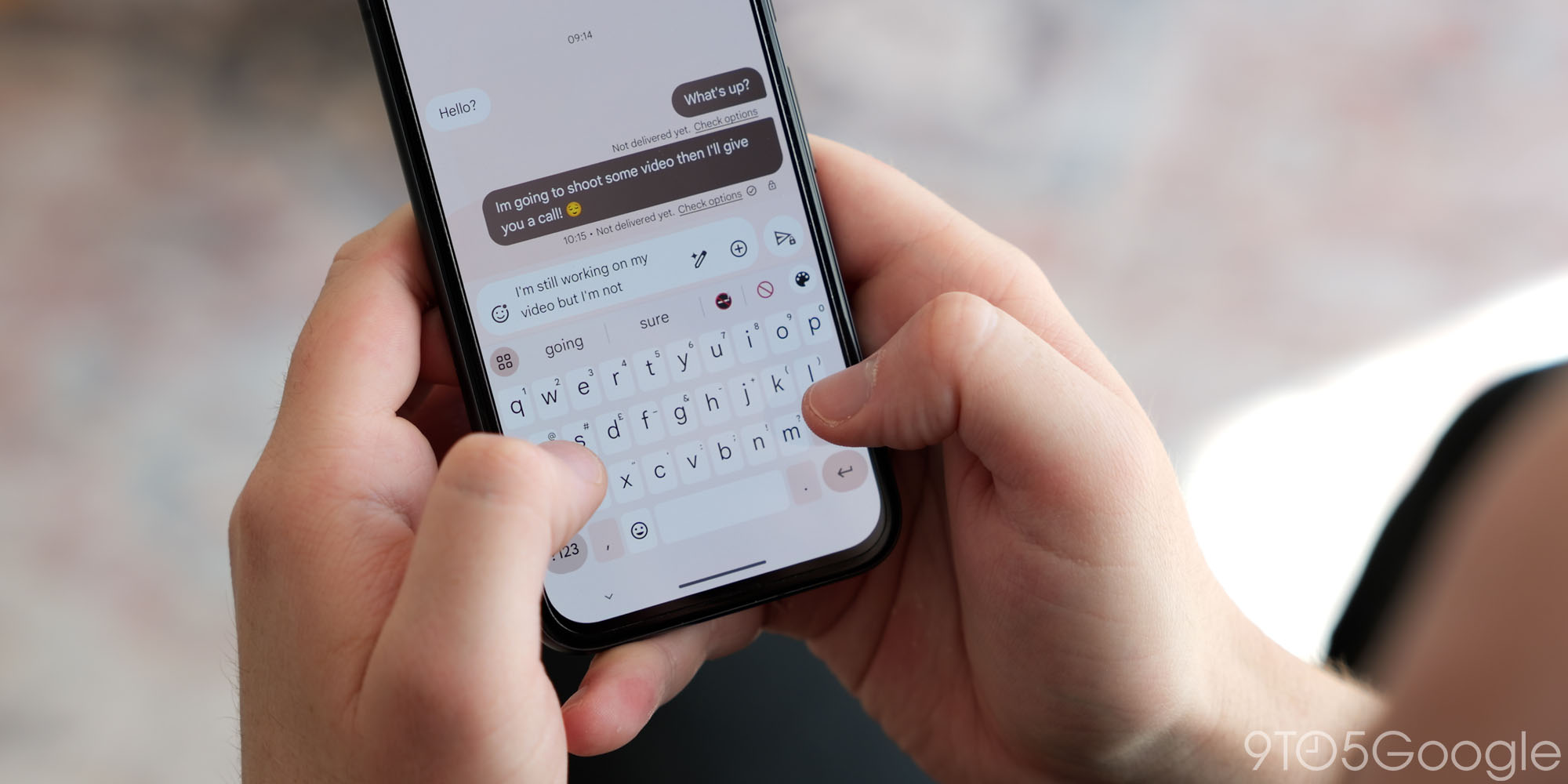
This shift marks a significant departure from the traditional keyboard aesthetic that Gboard users have become accustomed to. Letter keys are now rendered as circles, lending a softer, more organic feel to the keyboard layout. The space bar, along with other functional keys like the shift, backspace, and enter buttons, have been transformed into pill-shaped keys, offering a cohesive visual language across the entire keyboard.
While the fundamental functionality of the keyboard remains unchanged – the touch targets for each key are expected to remain consistent – the visual impact of this redesign is undeniable. The new shapes introduce a fresh and contemporary aesthetic to Gboard, aligning it with the ongoing trend towards rounded designs in modern user interfaces. Google has been gradually refining the Gboard interface, and this change represents a substantial step in that evolution.
The move away from the traditional square or rectangular key shape is noteworthy. For decades, keyboards, both physical and virtual, have predominantly relied on these angular forms. This design choice stemmed from practical considerations, such as ease of manufacturing and visual clarity. However, with advancements in display technology and manufacturing processes, designers are now exploring more adventurous and aesthetically pleasing alternatives.
The circular and pill-shaped keys offer a softer, more approachable look. The rounded edges create a sense of fluidity and visual harmony, potentially making the typing experience more enjoyable. This change can be seen as part of a larger trend in UI design towards softer shapes and more rounded elements.
One potential drawback highlighted in initial testing is the reduced space around symbols when the "Long press for symbols" feature is enabled. This feature allows users to access secondary characters and symbols by long-pressing on a letter key. In the previous design, these symbols were positioned in the top-right corner of the key, providing ample visual separation from the primary letter.
With the new circular design, the symbol is now positioned directly above the letter, potentially creating a more cluttered and cramped appearance, especially for users who frequently use this feature. This could lead to accidental activation of symbols, especially for users with larger fingers or those who prefer a more spacious keyboard layout. Google will need to carefully monitor user feedback on this aspect of the design and consider potential adjustments to optimize the placement of symbols.
The article also notes the change in key shapes moves Gboard away from the physical feel of laptop and desktop keyboards, which traditionally employ more square keys. This highlights the divergent evolution of virtual and physical keyboards. Physical keyboards are often optimized for tactile feedback and precise key travel, while virtual keyboards prioritize visual clarity, responsiveness, and adaptability to different screen sizes.
For users who prefer a more traditional keyboard appearance, Gboard offers the option to disable key borders entirely. This can be done by navigating to Gboard Settings > Theme and making a selection that removes the key borders. This feature allows users to customize the look of their keyboard to suit their personal preferences.
The introduction of circle and pill-shaped keys follows other recent aesthetic changes to Gboard, including the simplification of the Dynamic Color theme to just two shades and a modification to the shortcut button in the suggestion strip. These incremental changes demonstrate Google’s ongoing commitment to refining the Gboard user interface and providing a more streamlined and visually appealing typing experience.
The fate of this bold new design remains uncertain. As it is currently only available to a limited group of beta testers, Google will be carefully evaluating user feedback and performance data to determine whether to roll it out to a wider audience. The company will likely be paying close attention to how users respond to the new key shapes, the potential issues with symbol placement, and the overall impact on the typing experience.
If the feedback is positive, it is likely that the new design will eventually be released to all Gboard users in a future update. However, if significant issues are identified, Google may choose to modify the design or even abandon it altogether. The beta testing process is crucial for identifying and addressing potential problems before a feature is released to the general public.
The introduction of circle and pill-shaped keys is a bold move that could significantly alter the look and feel of Gboard. Whether this change will be embraced by users remains to be seen, but it certainly demonstrates Google’s willingness to experiment with new design ideas and push the boundaries of keyboard aesthetics.
This potential Gboard redesign is just another example of how Google is constantly innovating and striving to improve the user experience. The tech giant has a long track record of iteratively refining its products based on user feedback and usage data. Gboard, being one of the most used keyboard apps on the market, is central to how many users interact with their Android devices. A change like this one can either be a refreshing upgrade, or a nuisance based on user interaction, so it is important that Google takes all user feedback into consideration before making the design available to the public.