
Google Prioritizes Widget Quality on Android with New Tiers
Google is doubling down on the user experience for Android widgets, an often-overlooked but powerful feature of the operating system. Recognizing the potential of widgets to provide quick access to information and functionality directly from the home screen, the Android team has been actively working to improve their overall quality and consistency. As part of this effort, Google is prominently featuring its Android Widget Quality Tiers, a system designed to guide developers in creating widgets that are not only functional but also visually appealing and highly user-friendly.
These quality tiers, initially introduced in October, serve as a comprehensive framework for developers to assess and enhance their widgets. The ultimate goal is to ensure that users encounter a consistently high-quality experience when using widgets across the Android ecosystem. The tiers provide clear guidelines and expectations, empowering developers to create widgets that seamlessly integrate with the Android interface and provide real value to users.
The quality tiers are structured around several key aspects of widget design and functionality, each with specific criteria for different levels of quality. A widget that fails to meet the basic requirements across these aspects is classified as "Low Quality," indicating significant areas for improvement. Google’s intention is clear: to encourage developers to strive for higher quality widgets that provide a superior user experience.
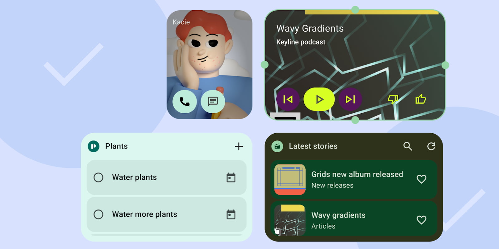
One of the foundational pillars of widget quality is Content. Google emphasizes that widgets must provide relevant and up-to-date information. A "Low Quality" widget is characterized by consistently stale or untimely data. To achieve a higher tier, widgets must actively refresh their content, particularly after a user interacts with the widget or takes action within the associated app. Furthermore, Google stresses the importance of user control, stating that a high-quality widget "must let users manually refresh content, if there is an expectation the data refreshes more frequently than the UI." This empowers users to ensure they are always viewing the most current information.
Layout is another critical aspect that Google addresses within the quality tiers. The layout of a widget directly impacts its usability and visual appeal. Google defines different tiers based on how well a widget utilizes the available space on the home screen grid. A Tier 2, or "good," widget is expected to "touch at least two opposing edges of the [launcher] grid," effectively spanning either vertically or horizontally. However, to achieve the highest Tier 1 rating, a widget "MUST hit all four edges of the bounds of the grid," maximizing its presence and impact on the home screen. This guidance encourages developers to design widgets that feel integrated and take full advantage of the available screen real estate. Google even references its own apps as examples, noting that while newer first-party widgets adhere to the edge-to-edge design, some older widgets fall short of this standard, illustrating the ongoing effort to elevate widget design across the platform. Additionally, Google recommends the use of headers for scrolling lists and grids within widgets. These headers function as miniature app bars, providing context through an Icon (for branding and app launch), Title, and Actions (like refresh or search), further enhancing the user experience.
The Color scheme of a widget plays a significant role in its overall aesthetic and accessibility. Google sets minimum requirements for color contrast to ensure readability and usability for all users. A Tier 2 widget must provide "sufficient color contrast." However, achieving a Tier 3 rating requires more advanced theming capabilities. This might include support for light and dark modes, integration with Android’s Dynamic Color theming system, or the use of branded theme colors. By encouraging the implementation of advanced color features, Google aims to create widgets that seamlessly blend with the user’s overall Android theme and provide a visually cohesive experience.
Discovery is another key area where Google is pushing for improvements. The quality tiers emphasize the importance of accurate and informative previews in the Widget picker. This allows users to easily understand the purpose and functionality of a widget before adding it to their home screen. While accurate previews are a basic requirement, Google encourages developers to go further by providing user-content previews, such as displaying an actual profile image in a contacts widget. This level of personalization enhances the user experience and makes the widget more engaging. Furthermore, Google stresses the importance of providing clear and unique names and descriptions for each widget, making them easily identifiable and searchable within the Widget picker.
Finally, Google emphasizes the importance of System Coherence in creating high-quality widgets. This refers to how well a widget integrates with the overall Android system and adheres to its design principles. For example, Google specifies that "Rectangular widgets must use the corner radius provided by system (OEM specific)," ensuring a consistent look and feel across different devices. Additionally, Google encourages the use of progress indicators and transition animations when entering or exiting the associated app, providing a smooth and seamless user experience.
By introducing and promoting these Android Widget Quality Tiers, Google is sending a clear message to developers: prioritize quality and user experience when designing widgets. The tiers provide a concrete framework for evaluating and improving widgets, ultimately leading to a more consistent and valuable experience for Android users. As Google continues to refine and promote these guidelines, we can expect to see a significant improvement in the overall quality and usefulness of widgets across the Android platform. This initiative has the potential to revitalize widgets and transform them into an even more integral and valued part of the Android user experience. The focus on content freshness, thoughtful layout, appealing color schemes, improved discovery, and system coherence will undoubtedly contribute to a more polished and user-friendly widget ecosystem. This is a positive step towards unlocking the full potential of widgets and providing users with quick and easy access to the information and functionality they need directly from their home screens.