
Android Auto’s Potential Button Shuffle: Muscle Memory Massacre or Minor Adjustment?
Android Auto, Google’s in-car infotainment system, is constantly evolving, bringing new features and tweaks designed to enhance the driving experience. However, not all changes are universally welcomed, and a recent development currently being tested in the Android Auto v14.4 beta has sparked debate amongst users: a potential rearrangement of the media player controls on the dashboard widget. While seemingly a small alteration, this button shuffle could have a significant impact on drivers’ muscle memory and overall usability.
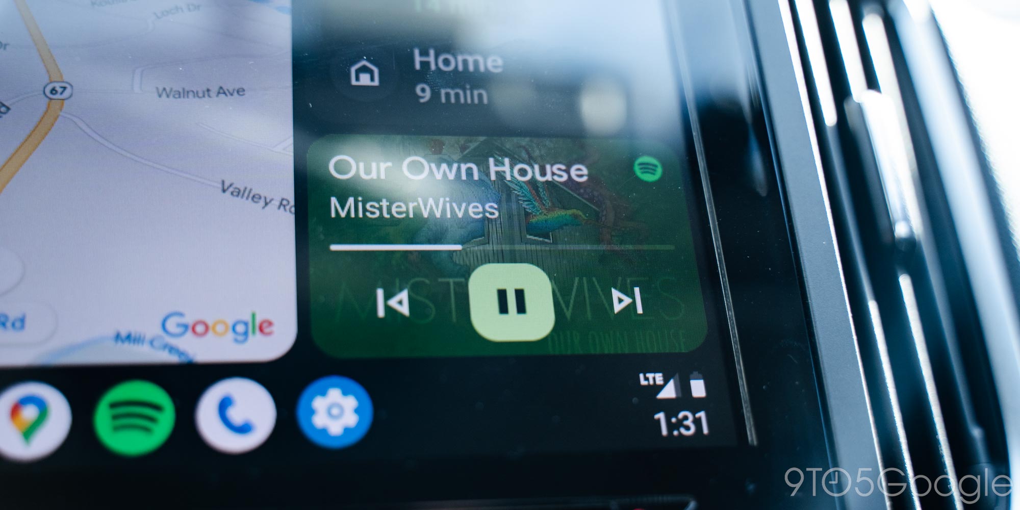
The current, and long-standing, layout of media player controls in Android Auto, mirroring many other media interfaces, positions the "back" button on the left, the play/pause button in the center, and the "skip forward" button on the right. This arrangement has become deeply ingrained in the muscle memory of countless drivers who rely on Android Auto for entertainment and navigation during their commutes and road trips. Without even looking, a driver can instinctively reach out and pause their music or skip to the next track.
The proposed change, discovered by Android Authority and enabled in the latest beta version, flips this familiar order. The play/pause button is moved to the leftmost position, followed by the "back" and "forward" buttons. This may seem like a minor adjustment on paper, but the implications for usability could be considerable.
One of the primary concerns is the disruption of established muscle memory. Drivers who have grown accustomed to the current layout will likely find themselves instinctively reaching for the wrong button, particularly in situations where they need to quickly pause their music or skip a track while maintaining focus on the road. This could lead to frustration and potentially even unsafe driving conditions, as drivers momentarily divert their attention to correct their button presses.
The rationale behind this potential change remains unclear. One possibility is that Google believes the new layout is more ergonomically sound, placing the most frequently used button – presumably the play/pause button – in a more easily accessible location. This might be particularly relevant for drivers with smaller hands or those who prefer to keep their hand resting closer to the left side of the screen. However, this potential ergonomic benefit may come at the cost of sacrificing the intuitive familiarity of the existing layout.
Another question arises regarding the consistency of this change across the Android Auto interface. Currently, the experimental layout appears to be limited to the dashboard widget, leaving the media player controls within the main app interface untouched. This inconsistency could further complicate matters for users, as they would need to adapt to two different button arrangements depending on which part of the interface they are interacting with. It’s possible that Google is testing the waters with the dashboard widget before potentially rolling out the change to the entire Android Auto system, but this remains speculative.
The fact that the altered layout has been observed in both Spotify and YouTube Music suggests that the change is not specific to a particular media app, but rather a system-wide modification being implemented by Google. This indicates a broader intention to standardize the media player controls across all compatible apps within the Android Auto ecosystem.
Despite the potential drawbacks, it’s important to remember that this is still a beta feature, and Google may ultimately decide not to implement the change in the final release of Android Auto. User feedback will undoubtedly play a crucial role in shaping Google’s decision-making process. Drivers who are participating in the beta program are encouraged to provide their honest opinions on the new layout, highlighting both its potential benefits and drawbacks.
It’s also worth noting that many drivers primarily rely on steering wheel controls for managing their media playback, rendering the button arrangement on the Android Auto screen less critical. Steering wheel controls offer a convenient and safer alternative to directly interacting with the infotainment system, allowing drivers to keep their hands on the wheel and their eyes on the road. For these users, the button shuffle may have minimal impact on their overall driving experience.
Ultimately, the success of this potential change hinges on whether the perceived ergonomic benefits outweigh the disruption of established muscle memory. Google will need to carefully weigh the pros and cons, taking into account user feedback and data on usage patterns, before making a final decision. The goal, as always, should be to create an intuitive and user-friendly in-car experience that enhances, rather than detracts from, the driving experience.
The future of Android Auto’s media player controls remains uncertain. Whether this button shuffle becomes a permanent fixture or a fleeting experiment, it serves as a reminder that even seemingly minor changes can have a significant impact on the user experience. Only time will tell if this potential change will be remembered as a muscle memory massacre or a minor adjustment.