
Android’s Design Revolution: A Leap Forward or a Step Back?
The smartphone software landscape, dominated by iOS and Android, has undeniably settled into a comfortable, albeit predictable, rhythm. Both operating systems prioritize functionality and ease of use, a necessary constraint when catering to billions of users worldwide. Innovation in core UI elements has become incremental, a stark contrast to the rapid evolution of features and performance. However, the winds of change may be blowing, at least for Android, with Google seemingly poised to inject a dose of bold design into its mobile operating system.
The upcoming Google I/O developer conference is set to unveil "Material 3 Expressive," a new design language for Android 16 and Wear OS. Described as Google’s most opinionated take on Android to date, Material 3 Expressive signals a departure from the minimalist aesthetic that has defined the platform for years. The question on everyone’s mind: will this fresh visual direction entice iPhone users to switch allegiances, or will it alienate the Android faithful who have grown accustomed to the platform’s current design language?
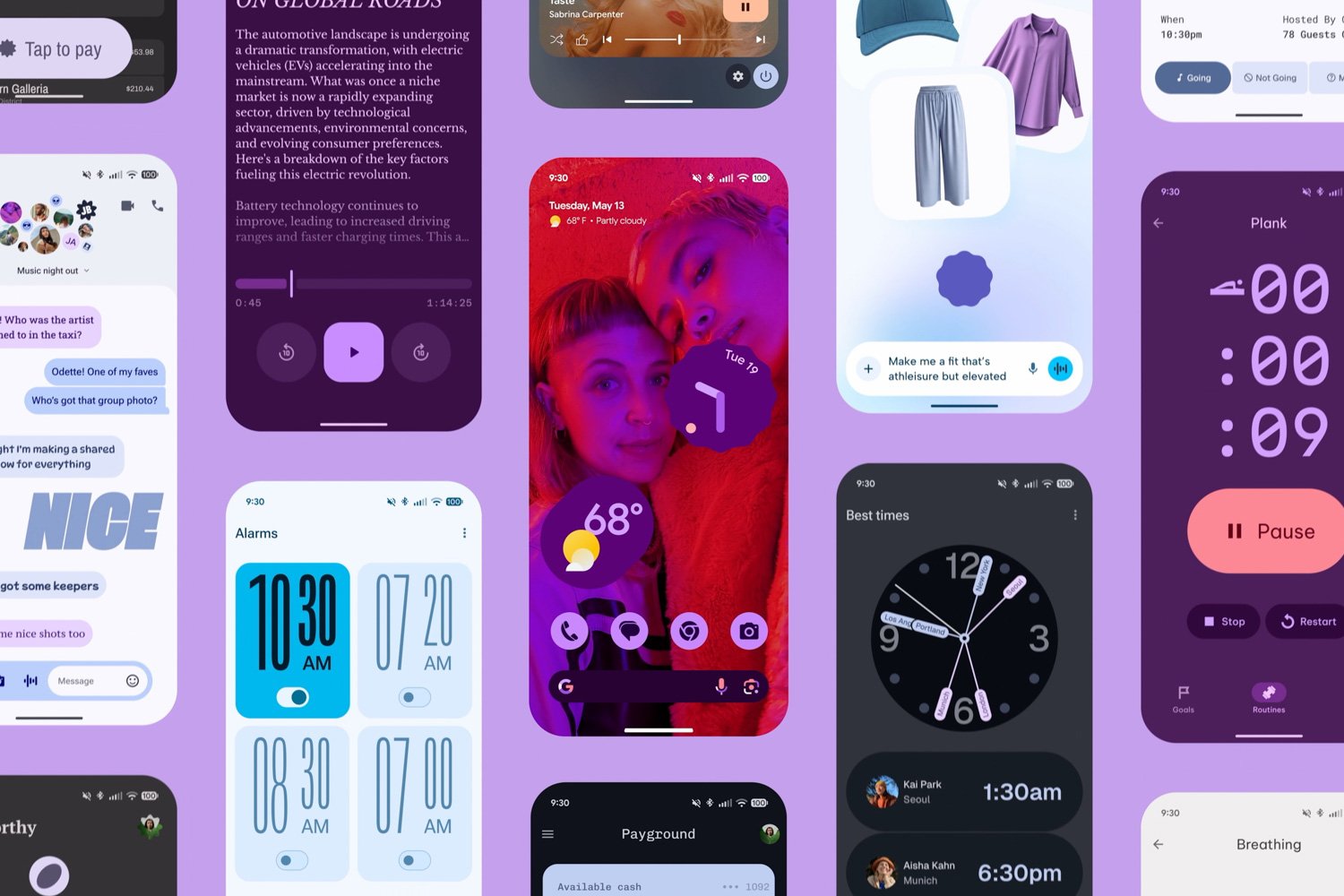
While an "accidental" blog post offered an initial glimpse of Material 3 Expressive, recently released videos and GIFs showcase the new Android and Wear OS in action, revealing a visually compelling and energetic user interface. Beyond the use of bolder colors and striking fonts, the overall impression is one of increased fluidity and responsiveness. Animations are more pronounced, creating a sense of organic movement that was previously absent. For those with an appreciation for graphic design, Material 3 Expressive is undeniably a refreshing change of pace.
Google’s initial foray into expressive design with Material You in Android 12 was met with enthusiasm. The enhanced customization options, diverse typefaces, and playful details, such as the squiggly lines in the media player controls, provided a welcome contrast to iOS’s relatively uniform appearance. Material 3 Expressive appears to be a natural progression of this design philosophy, pushing Android further in a direction that embraces visual flair and individuality.
However, the shift towards a more expressive design raises concerns about potential usability issues. Google asserts that Material 3 Expressive is the result of extensive research, spanning three years, that analyzed user attention patterns and emotional responses to various design elements. While the research may indicate a preference for larger buttons and a floating toolbar, the real-world impact on everyday users remains uncertain. It’s conceivable that some users may find Material 3 Expressive to be cluttered, making it more challenging to distinguish interactive elements from mere decoration.
Google’s internal studies suggest that the design changes actually enhance usability. For example, they claim that a significantly larger "Send" button in messaging or email apps allows users to locate it "four times faster." But these claims must be subjected to broader testing to determine if they stand up in diverse real-world scenarios.
History offers a cautionary tale. Microsoft’s "Metro UI," which debuted on the Zune and later became the cornerstone of Windows Phone and Windows 8, was initially praised for its futuristic and distinctive design. Metro UI’s tile-based interface was seen as a bold alternative to the grid of icons that defined iOS and early versions of Android. Despite its clean lines and seemingly intuitive approach, consumers ultimately found Metro UI confusing and difficult to master. The lesson: prioritizing visual appeal over usability can backfire, leading to user frustration and adoption resistance.
Material 3 Expressive introduces subtle, non-visual enhancements as well. The "Live Updates" feature mirrors iOS’s Dynamic Island, providing real-time, at-a-glance information such as the estimated arrival time of an Uber Eats delivery. A more dynamic blur effect when pulling down the notification shade adds a touch of visual sophistication.
Interestingly, Material 3 Expressive appears to be particularly well-suited to Wear OS, Google’s smartwatch platform. The rounded buttons and bubbly animations complement the curved designs of smartwatches like the Pixel Watch 3 and OnePlus Watch 3, creating a more harmonious and fluid user experience. In the past, Wear OS often felt like a UI designed for square screens awkwardly adapted to round devices. Material 3 Expressive addresses this mismatch, enhancing the overall usability and aesthetic appeal of the platform.
The true test of Material 3 Expressive will come with its public release. If Google adheres to its typical beta program, users can expect to experience the new design language on Android 16 and Wear OS in the coming weeks. User feedback will be crucial in determining whether Material 3 Expressive truly represents a step forward for Android, or whether it’s a case of style over substance. Ultimately, the success of Material 3 Expressive will depend on Google’s ability to strike a delicate balance between visual innovation and user-friendly design. The gamble is considerable, but the potential rewards – a revitalized Android ecosystem that attracts both new and existing users – are well worth the risk. This new design is more than a cosmetic update; it’s a statement that Android is still evolving and pushing boundaries in the mobile landscape.