
Google Refreshes Iconic ‘G’ Icon After Decade-Long Stint
Google is subtly evolving its visual identity, marking the first update to its distinctive ‘G’ icon in nearly ten years. The update introduces a vibrant gradient effect, departing from the solid, segmented colors that have defined the icon for the past decade. This seemingly minor tweak reflects a broader trend toward modernization within Google’s product design, aligning with the aesthetics of recent initiatives like Gemini and AI-powered Search features.
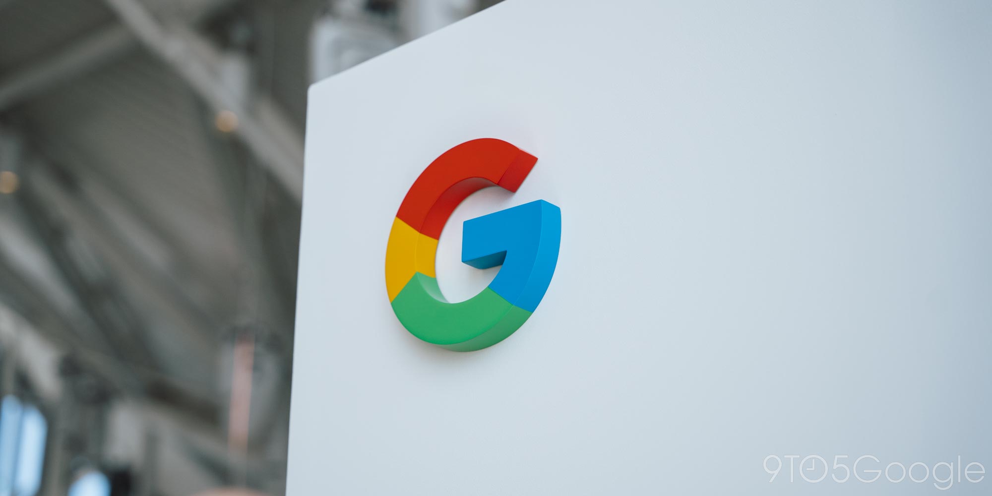
The previous major logo overhaul occurred on September 1, 2015, when Google transitioned to the Product Sans typeface for its primary logo. This marked a significant shift away from the earlier serif font and ushered in a new era of visual branding for the tech giant. Alongside the main logo update, the ‘G’ icon underwent a transformation as well. The previous iteration, a lowercase white ‘g’ set against a solid blue backdrop, was replaced with the now-familiar circular icon featuring four distinct color segments: blue, red, yellow, and green.
For almost a decade, this four-color icon has served as a ubiquitous visual shorthand for Google, appearing across various platforms, applications, and services. It has become instantly recognizable, symbolizing the company’s vast reach and diverse portfolio. Now, Google is refining this iconic symbol, injecting a fresh dose of vibrancy and dynamism.
The key change in this update lies in the transition from solid, distinct color blocks to a seamless gradient. The new ‘G’ icon features a smooth color transition, with red seamlessly blending into yellow, yellow gracefully merging into green, and green flowing into blue. This creates a more fluid and visually appealing effect, lending the icon a sense of depth and movement. The gradient effect evokes a sense of modernity and sophistication, reflecting Google’s ongoing commitment to innovation and cutting-edge design.
This design choice also appears to be strategically aligned with the visual language of other recent Google initiatives. The Gemini project, Google’s ambitious AI model, prominently features gradients in its visual branding. Similarly, the AI Mode within Google Search utilizes gradient effects for visual cues and shortcuts. By adopting a similar aesthetic for the ‘G’ icon, Google is creating a more cohesive and consistent visual identity across its diverse range of products and services.
The updated ‘G’ icon has already begun to appear in the wild, making its debut on the Google Search app for iOS. Users who updated the app witnessed the subtle but noticeable change. However, the updated icon has not yet been rolled out to other platforms, such as Android or the web. This staggered rollout suggests that Google is taking a measured approach, carefully monitoring user response and making adjustments as needed before implementing the change more broadly.
The impact of this subtle change may vary depending on the context in which the icon is displayed. On the homescreen of a mobile device, where users frequently interact with the Google Search app, the updated icon may be more readily apparent. However, as a tiny browser favicon, the gradient effect may be less noticeable, especially given the limited screen real estate.
It’s important to note that Google is not currently changing its primary six-letter logo. The focus of this update is solely on the ‘G’ icon. Whether this update will extend to other product logos remains to be seen. However, the company’s other four-color logos, such as those for Chrome and Maps, could potentially benefit from a similar gradient treatment. Applying the gradient effect to these logos could further enhance visual consistency and reinforce Google’s commitment to modern design principles. The application of a gradient to the Chrome logo, for instance, could enhance its already dimensional appearance, making the central blue sphere appear to glow. Likewise, the Maps logo could benefit from a similar application of the gradient, possibly using color transitions to emphasize geographic transitions from land to sea or variations in terrain.
The subtle nature of this update reflects a broader trend in design, where companies are increasingly opting for incremental changes rather than radical overhauls. This approach allows brands to evolve their visual identity without alienating their existing user base or disrupting brand recognition.
While the change may seem minor, the updated ‘G’ icon represents a significant milestone for Google. It marks the first refresh of this iconic symbol in nearly a decade, signaling the company’s ongoing commitment to innovation and visual refinement. The gradient effect adds a touch of vibrancy and modernity, aligning the icon with the aesthetics of recent Google initiatives like Gemini and AI-powered Search features.
This subtle update demonstrates Google’s ability to evolve its brand identity while maintaining its core values. By embracing a gradient effect, Google is creating a more cohesive and visually appealing experience for users across its diverse range of products and services. As the updated ‘G’ icon gradually rolls out to more platforms, it will undoubtedly become an increasingly familiar symbol of Google’s continued innovation and leadership in the tech industry. The company is taking a measured approach to the rollout of this new icon, allowing for careful monitoring of user feedback and the opportunity for any necessary fine-tuning. This demonstrates a keen understanding of how users perceive branding and the importance of brand recognition.