
One UI 7’s Misstep: Great Visuals, Frustrating Defaults
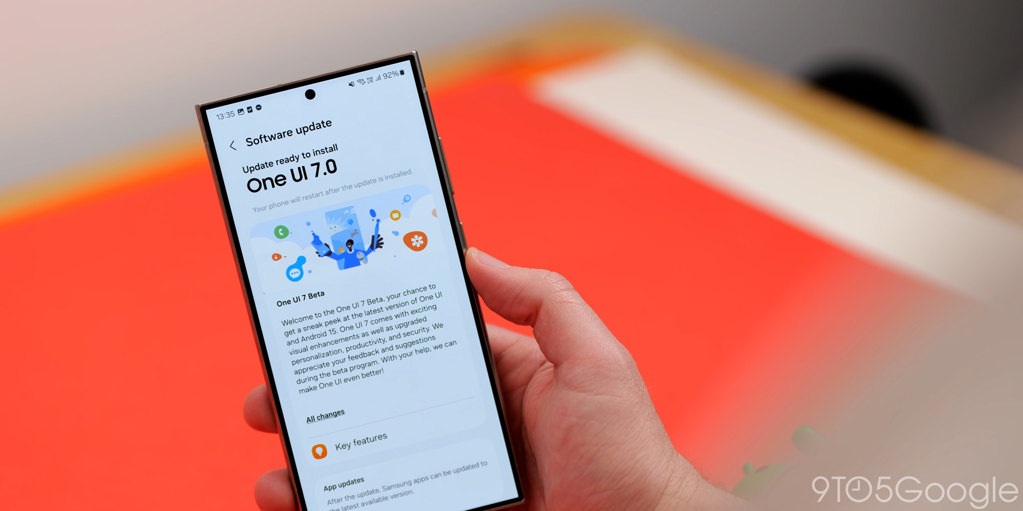
Samsung’s One UI 7, despite its visual appeal, has stumbled due to its handling of default settings, particularly regarding the Quick Settings panel and lockscreen notifications. While the update brings welcome design improvements, the way these specific functional changes were implemented has caused frustration among both casual users and tech enthusiasts.
The launch of One UI 7 was already marred by delays, arriving later than other Android 15 updates and experiencing further setbacks. This less-than-smooth introduction set the stage for the more significant problem: the implementation of default UI changes without sufficient user guidance or readily apparent customization options.
One UI 7 primarily focuses on visual enhancements, with only a handful of functional changes. These visual updates are where the update truly shines, providing a refreshed and modern look. However, the altered functionalities are where Samsung missed the mark. The problem lies in how Samsung introduced and enforced these changes on its vast user base.
When rolling out software updates to millions of users, a measured approach is essential. Tech enthusiasts often embrace change readily, but the average user typically needs more time and guidance to adapt. This is where One UI 7 has become a double-edged sword. The changes themselves aren’t inherently bad, but the way they were deployed has led to confusion and dissatisfaction.
Two changes, in particular, stand out as problematic: the new Quick Settings experience and the repositioned lockscreen notifications.
Historically, One UI has consolidated notifications and Quick Settings within the same panel. A single swipe down reveals notifications, and a subsequent swipe displays the Quick Settings toggles. This behavior has become ingrained in users’ muscle memory. One UI 7 disrupts this established pattern by separating notifications and Quick Settings. Now, notifications appear when swiping down from the left side of the screen, while Quick Settings are accessed by swiping down from the right.
While some users might find this split behavior to be an improvement, the issue is that it’s enabled by default without clear instruction on how to revert to the previous style. Samsung does display a brief tutorial after the update, showcasing the new gesture, but it fails to emphasize that this behavior is optional. The setting to revert back to the combined notification and Quick Settings panel is buried within the settings menu, making it difficult for the average user to find and implement.
The second major point of contention is the redesigned lockscreen notifications. Samsung has relocated notifications from the center of the screen to the top corner. This change effectively makes notifications almost invisible at a glance.
This drastic shift is a significant departure from the familiar lockscreen layout. Users accustomed to glancing at the center of the screen to check notifications now have to consciously look towards the top corner, a change that disrupts established habits. Furthermore, many users might not even realize that they can customize the notification style, leading to ongoing frustration.
While these changes aren’t inherently flawed, Samsung’s approach to implementing them raises concerns. The problem isn’t that Samsung introduced new features, but rather that it enforced them without proper user education and readily accessible customization options.
One possible solution would have been to provide users with a more prominent notification after the update, detailing the changes and offering clear instructions on how to revert to the previous settings. While Samsung attempted this with the Quick Settings change, the buried setting undermines its effectiveness.
The lockscreen notification change presents a more complex challenge. Communicating the customization options effectively could be achieved through a prominent post-update notification. However, perhaps a less drastic initial change would have been a better approach. There was no compelling reason to move the notifications to the top corner in the first place.
Ideally, Samsung could have defaulted to a design similar to Google’s "Cards" style, which is used on Pixel phones and has been refined in One UI 7. This approach would have provided a more familiar and less disruptive experience for users upgrading from previous versions of One UI.
Ultimately, these changes have caused frustration among a wide range of users, from casual smartphone users to dedicated tech enthusiasts. The issues highlight the importance of careful consideration when implementing UI changes, particularly when dealing with a large and diverse user base.
Additional News
Material 3 Expressive Leak
Google is preparing to launch a new design language called Material 3 Expressive. A leaked blog post from Google provided insights into the development of this new design, which is expected to play a significant role in Android 16. More details are anticipated to be revealed at the upcoming Google I/O event.
Battery Health on Pixel
Google has confirmed that older Pixel phones, specifically those prior to the Pixel 9 series and Pixel 8a, will not receive the Battery Health feature that is expected to be released with Android 16.
Other Tech News
- 9to5Mac: Apple is reportedly considering adding AI search partners to Safari as Google’s search engine usage declines.
- 9to5Toys: LEGO has unveiled a new Ideas Luxo Jr. set, celebrating Pixar’s iconic mascot.
- Electrek: The Kia EV5 has been spotted with several upgrades ahead of its global launch.