
Android 16 Set to Revolutionize Status Bar with Color-Coded Battery Icon and Dynamic Material 3 Expressive Design
Google is poised to introduce a significant overhaul to the Android user interface with the release of Android 16, a move that promises to elevate the mobile experience through a revamped status bar and a bold, expressive design language. Central to this transformation is a redesigned battery indicator, a key element of the upcoming Material 3 Expressive overhaul. Leaked details reveal that this new battery icon will leverage dynamic visuals and color-coding to provide users with instant, intuitive information about their device’s power status.
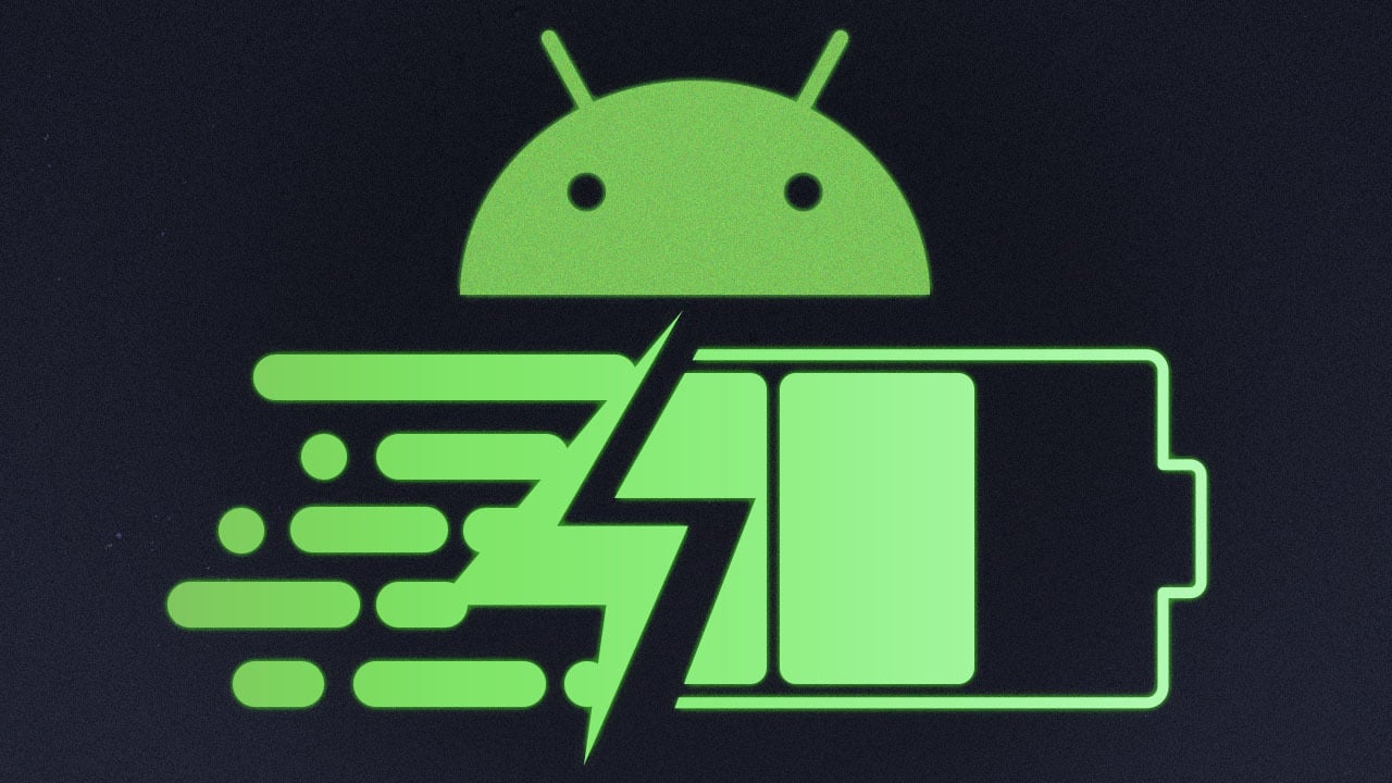
The redesigned battery icon signifies a departure from the traditional Android battery indicators. Adopting a horizontal layout with subtly rounded corners, it subtly nods to design choices seen in Apple’s iOS, reflecting a broader trend of design convergence in the mobile operating system landscape. However, Google’s implementation goes beyond mere aesthetics, focusing on enhanced functionality and user communication.
The defining characteristic of the new battery icon is its dynamic color-coding system. When the device is actively charging, the icon elegantly transforms into a vibrant green hue, accompanied by a clearly visible lightning bolt symbol. This provides immediate confirmation to the user that the charging process is underway. This eliminates any ambiguity and ensures that users are instantly aware of their device’s charging status.
When the device enters battery saver mode, a crucial feature for extending battery life in critical situations, the battery icon adopts a distinct yellow color. This yellow is paired with a plus sign, effectively communicating to the user that power-saving measures are active. This visual cue encourages users to be more mindful of their battery consumption and adjust their usage patterns accordingly.
Perhaps the most critical visual signal is triggered when the device’s battery level dips to a low threshold. In this scenario, the battery icon transitions to a striking red color, instantly alerting the user to the urgent need for recharging. This red alert serves as a prominent warning, preventing unexpected shutdowns and ensuring that users can take timely action to avoid service interruptions.
This color-coded system empowers users with a clear, concise, and readily understandable representation of their device’s power status. It eliminates the need for users to delve into settings menus or rely on numerical percentages, providing a quick and reliable visual assessment of battery health.
The design evolution extends beyond the battery icon. Android 16’s Material 3 Expressive design language encompasses a wider range of status bar elements, introducing a more vibrant and dynamic visual identity. Status bar icons, including those representing Wi-Fi connectivity and mobile data signals, are undergoing a significant transformation. These icons are being updated with bolder visuals and segmented designs, improving their clarity and visibility.
The objective is to enhance user experience by making essential information more readily accessible at a glance. By improving the clarity and prominence of these status bar icons, Google aims to reduce cognitive load and empower users to quickly understand their device’s connection status and network environment.
The lock screen, a primary point of interaction for users, is also receiving significant attention in Android 16. Adjustments are being made to the clock font to improve readability and overall visual appeal. Furthermore, the placement of date and temperature information is being carefully considered to optimize the lock screen’s layout and information hierarchy.
One of the most innovative aspects of the lock screen redesign is the integration of notifications into the layout. Notifications are now designed to dynamically influence the arrangement of lock screen elements, ensuring a cleaner and more organized appearance. This adaptive design approach ensures that notifications are presented in a visually coherent manner, without overwhelming the user or disrupting the overall aesthetic.
The notification panel is also slated for a significant aesthetic upgrade. The new design is expected to feature a blurred, transparent background, lending a touch of elegance and visual depth to the notification experience. This blurred background will complement the overall aesthetic of Material 3 Expressive, creating a cohesive and visually appealing user interface.
While these exciting design elements are not yet fully functional in the current Android 16 beta release, Google is actively working to refine and implement them in upcoming updates. The technology giant is expected to showcase these transformative changes at the highly anticipated Google I/O 2025 event. This event will provide a platform for Google to unveil the intricacies of the new design direction, offering developers and users a comprehensive understanding of the design philosophy behind Material 3 Expressive.
As Android 16 continues to evolve, users can eagerly anticipate a more visually engaging and user-friendly interface. The color-coded battery icon, the redesigned status bar elements, the dynamic lock screen, and the refined notification panel collectively contribute to a more intuitive and enjoyable mobile experience. Google’s commitment to innovation and user-centric design shines through in these enhancements, setting the stage for a new era of Android usability and visual appeal. The Material 3 Expressive overhaul is not just about aesthetics; it represents a fundamental shift in how users interact with their devices, prioritizing clarity, accessibility, and a seamless user experience. It is a testament to Google’s dedication to continuously improving the Android platform and delivering a world-class mobile operating system.