
Android 16 Leaks Suggest a Major Design Overhaul, Including Radically Redesigned Battery Icons
Google’s upcoming Android 16 operating system appears to be poised for a significant visual refresh, according to a flurry of recent leaks and hints. While the current beta version of Android 16 might not immediately strike users as drastically different, persistent leaks suggest that Google is working on something substantial behind the scenes, specifically a new design language dubbed "Material 3 Expressive." This rumored design language promises a more modern and dynamic user interface experience.
One of the most notable changes teased in these leaks is a complete redesign of the battery icons, a visual element that users interact with constantly. A recent leak originating from Mystic Leaks on Telegram provides a more detailed look at these revamped icons, showcasing a departure from the traditional Android battery indicator that we’ve grown accustomed to.
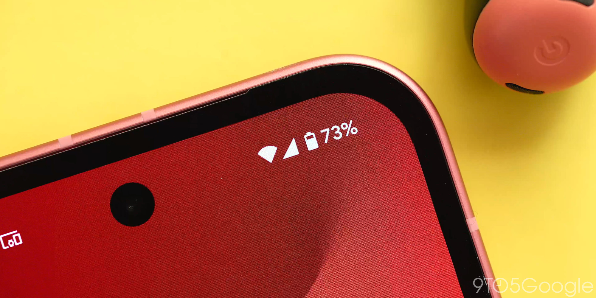
The leaked images reveal that the new battery icon in Android 16 is now oriented horizontally, a notable shift from the vertical orientation prevalent in previous Android versions. The icon itself features rounded corners, a design choice that immediately evokes comparisons to the user interfaces of Samsung’s One UI 7 and Apple’s iOS. This similarity suggests a potential trend toward softer, more visually appealing UI elements in the mobile operating system landscape.
However, the design changes extend beyond mere aesthetics. The influence of the rumored "Material 3 Expressive" design language becomes apparent when considering the dynamic behavior of the battery icon under specific conditions. The leaked images demonstrate how the icon’s color changes based on the remaining battery percentage and active power saving modes.
When the battery level drops to 20%, the icon is reportedly designed to change to either red or yellow. The color choice seemingly depends on whether battery saver mode is activated. A red icon would likely indicate a critical low battery state without battery saver enabled, urging the user to immediately find a power source. Conversely, a yellow icon would suggest that battery saver mode is active and helping to prolong battery life, even at the low percentage. In this scenario, a small "+" icon appears to the right of the battery icon, likely signifying that power-saving measures are in place.
The charging state of the device is also indicated through a distinct color change. When plugged in and charging, the battery icon reportedly turns green, providing clear visual feedback to the user. Furthermore, an icon representing electricity appears to the right of the battery indicator during charging. This subtle detail adds another layer of clarity and reinforces the charging status.
These dynamic color changes and contextual icons represent a significant departure from the relatively static battery icons of previous Android versions. The new design appears to prioritize clear and immediate communication of the device’s battery status, making it easier for users to understand and manage their power consumption.
The potential adoption of a horizontally oriented battery icon raises questions about its integration within the Android system UI. Traditionally, battery icons have resided in the status bar at the top of the screen, typically alongside other system indicators like network signal strength and time. A horizontal orientation could necessitate adjustments to the layout and arrangement of these status bar elements.
The redesign might also influence how battery information is presented in other parts of the Android system. For example, the battery settings menu might undergo a corresponding visual overhaul to align with the new design language. The changes could also extend to battery-related widgets and quick settings tiles, ensuring a consistent and unified user experience.
The leaked battery icon design is just one piece of the puzzle when it comes to understanding Google’s broader vision for Android 16. The rumored "Material 3 Expressive" design language promises a more fluid, adaptable, and visually engaging user interface. While the precise details of this new design language remain shrouded in mystery, the leaked battery icon offers a tantalizing glimpse into Google’s potential plans.
The emphasis on dynamic color changes, contextual icons, and a generally more modern aesthetic suggests that Google is aiming to create a more intuitive and user-friendly mobile operating system. By providing clearer and more immediate visual feedback, the redesigned battery icon could empower users to better manage their power consumption and extend their device’s battery life.
Of course, it’s important to remember that these leaks are not official confirmations. Google could ultimately choose to modify or abandon these design changes before the final release of Android 16. However, the consistency and frequency of these leaks suggest that a major visual overhaul is indeed in the works.
The response to these leaked designs has been mixed. Some users have expressed excitement about the potential for a more modern and visually appealing Android experience. Others have voiced concerns about the similarities to other mobile operating systems, suggesting a potential loss of Android’s distinctive identity.
Ultimately, the success of the Android 16 redesign will depend on how well Google executes its vision and how receptive users are to the changes. The new battery icons represent a bold step in a new direction, and it will be interesting to see how they are received by the wider Android community when Android 16 is officially released. The leak indicates that Google seems to be taking cues from popular design trends in other operating systems, like One UI and iOS, while simultaneously trying to put their own unique spin on the user experience through "Material 3 Expressive." The combination could lead to a fresher, more visually appealing Android.